
Web Design Example
This was a personal project.
As my initial personal project—excluding this portfolio website—the main concerns were organizing the HTML elements for readability and elegant design and creating an RSVP frontend that is straightforward for anyone to fill out. The sketches below show the beginning of the designing process.
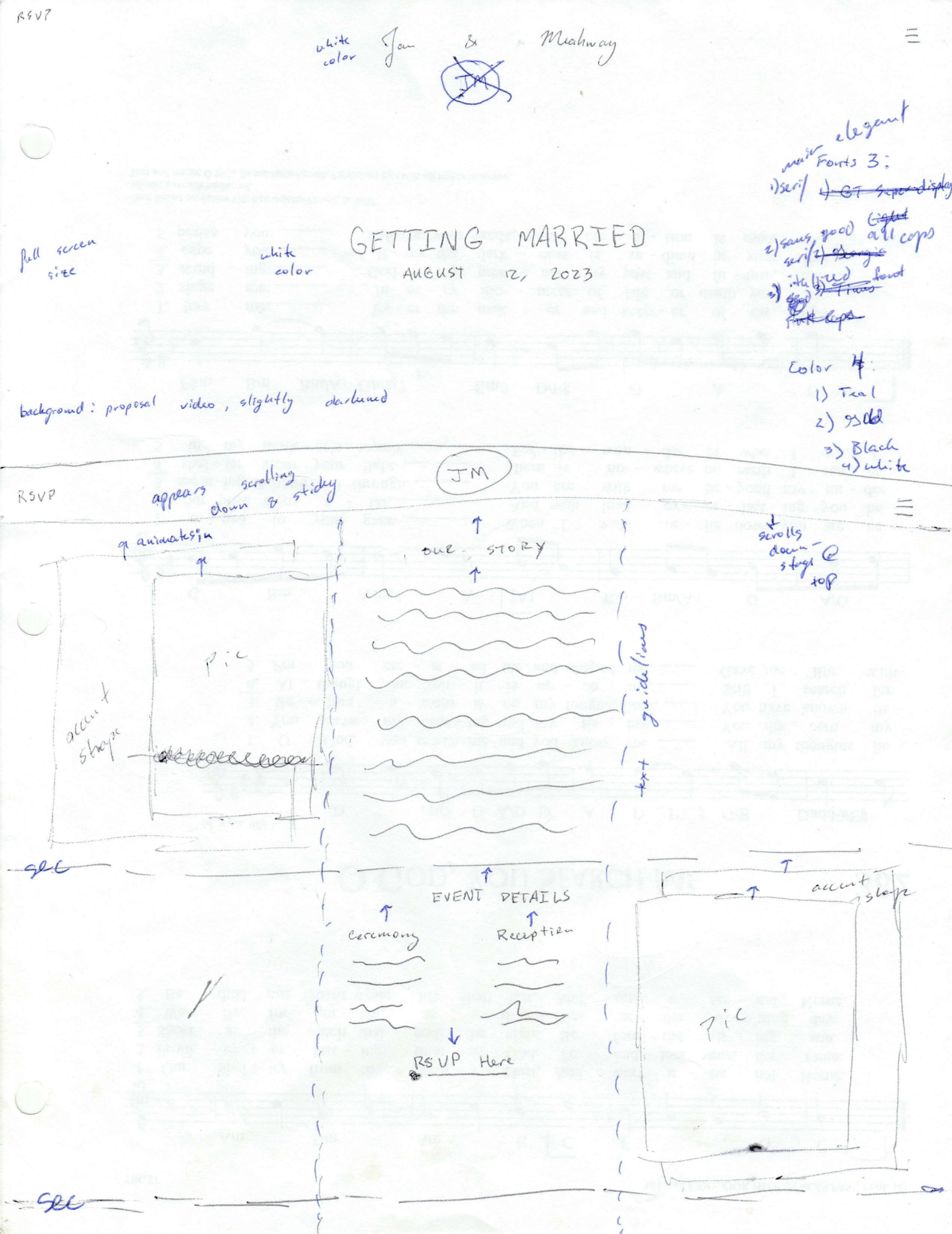
As seen in the sketches, I organized the home page to open on a main announcement, and three columns for the remaining detail elements. During the early sketches, I also chose three specific fonts that were readable and appropriate for the wedding material. At this point, I also settled with two main color accents for the website so that it doesn't appear cluttered or distracting.
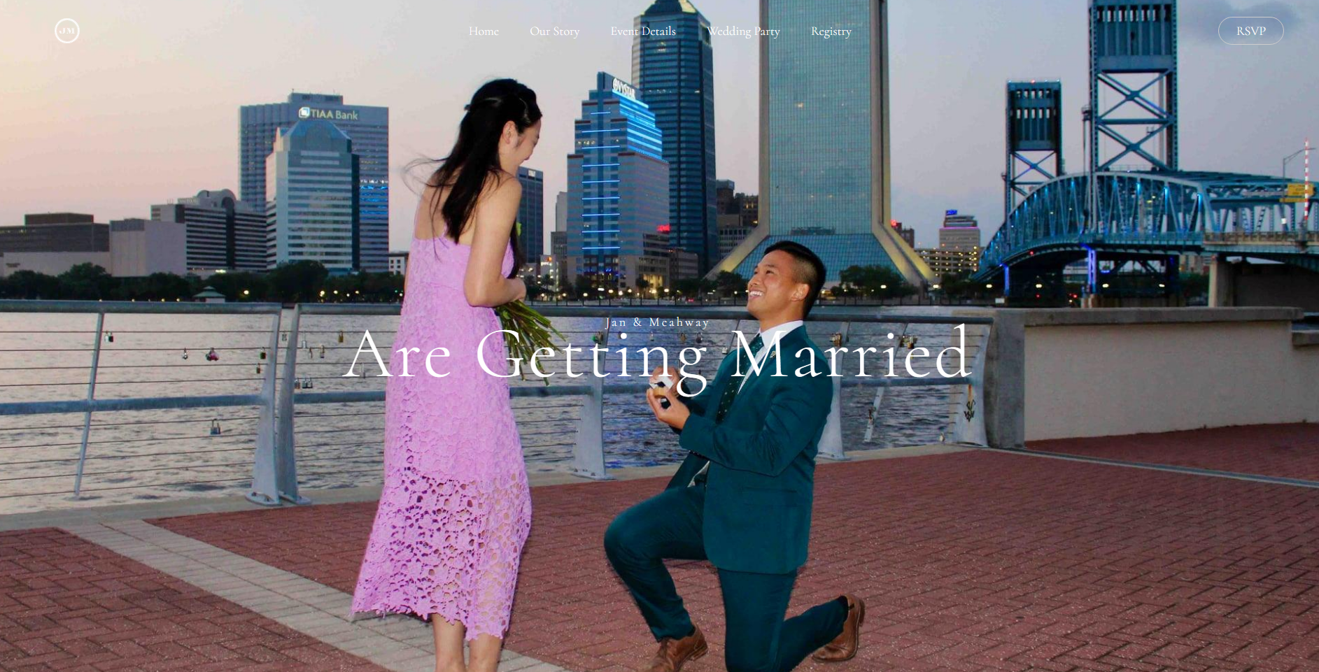
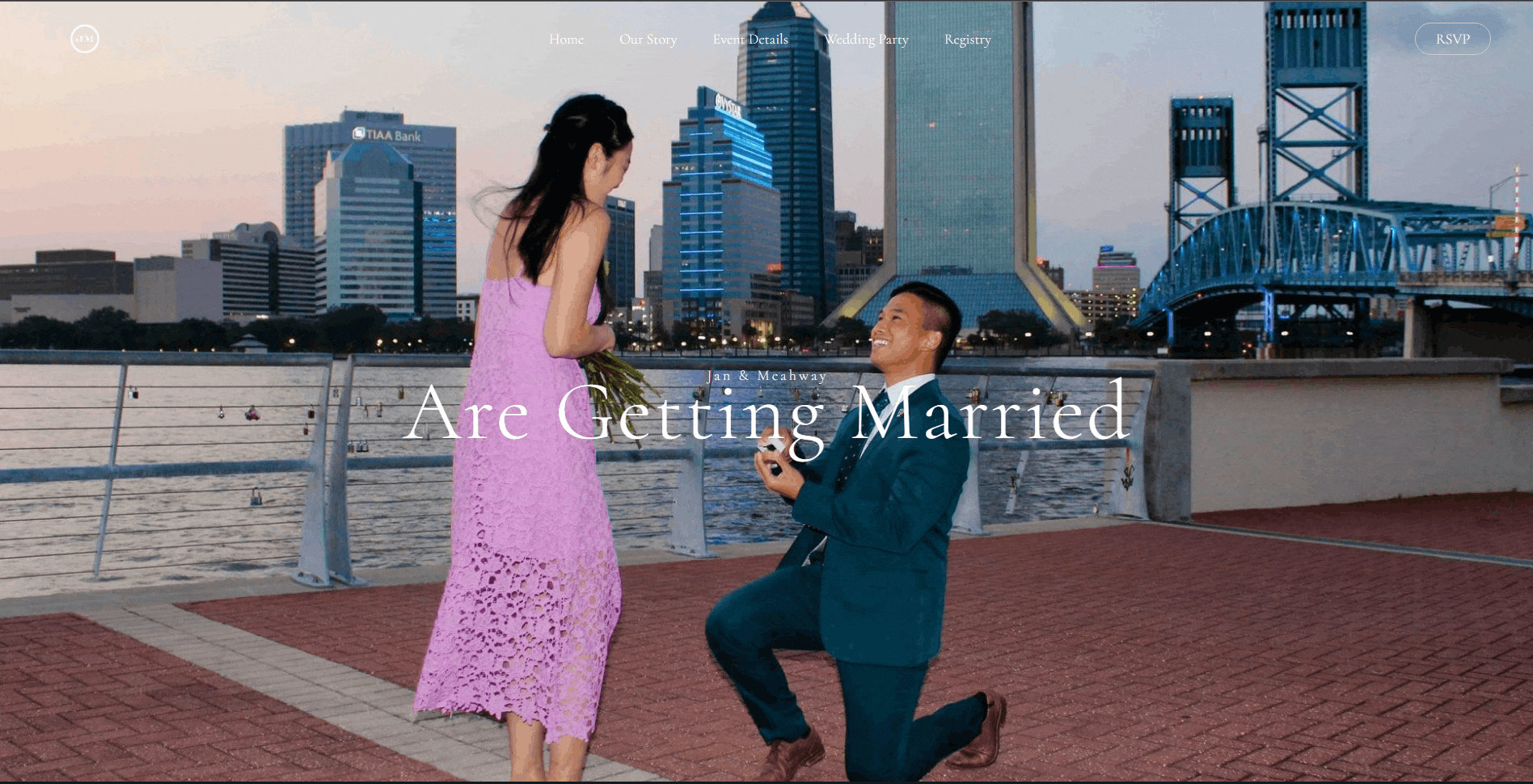
As seen in the image below, the landing page of the website is on a main announcement picture. The header has navigation options to go to the different parts of the home page and a button to go to the RSVP page. As the user scrolls down, sections for the couple's story, wedding ceremony and reception details, wedding party and registry will appear. The wedding reception has a button to go to the RSVP page as well while the wedding party section have clickable links that head to the bridesmaids or groomsmen pages respectively.
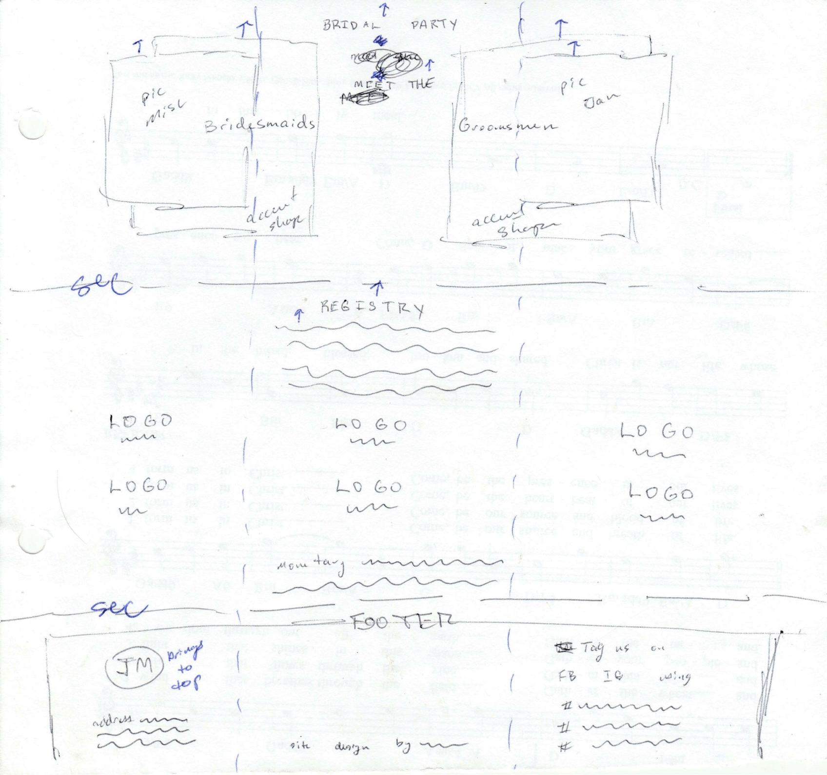
The groomsmen and bridesmaids pages all have cards that include a picture and short text description area of that respective person and have buttons to return to the home page. The registry section of the home page will lead to the various website that are part of the wedding registry.
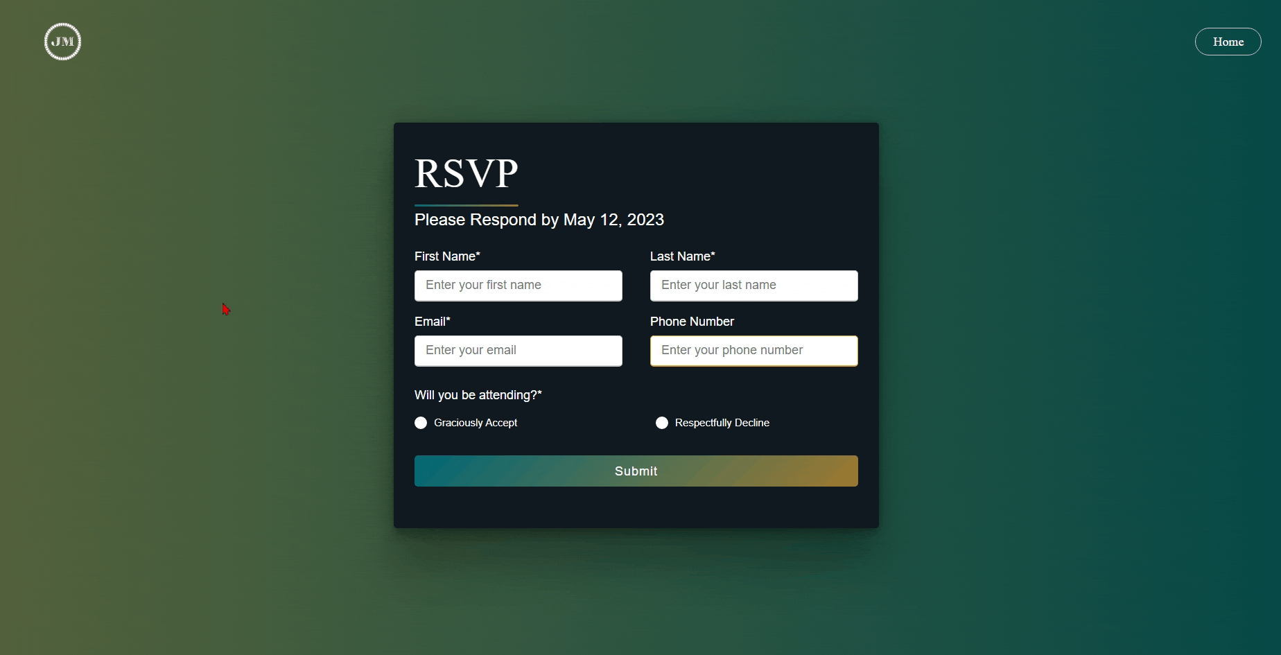
The image above shows the RSVP form that users can fill out. It will prompt the user to enter a first and last name, email, phone number, and attending status. Based on their response, meal options will appear and the ability to add another guest with their party will also be available along with their meal choices.